ShopDreamUp AI ArtDreamUp
Deviation Actions


Description
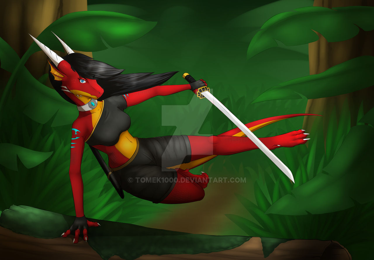
here is small practice i was doing to improve my skills.
Tiana is going throught jungle in hurry to get on time , why she is in hurry or who he chase its secret maybe i will show it in next art "maybe" XD
new lineart tool i did get from Thanks a lot Blaize! ^^ it realy did help me improve my style
also help from she gived me few advaices about anatomy and helped with fixing tail by teling how it realy should be placed also thanks to her i did get idea with shading pants for Tiana
Tiana is going throught jungle in hurry to get on time , why she is in hurry or who he chase its secret maybe i will show it in next art "maybe" XD
new lineart tool i did get from
Thanks a lot Blaize! ^^ it realy did help me improve my stylealso help from
she gived me few advaices about anatomy and helped with fixing tail by teling how it realy should be placed also thanks to her i did get idea with shading pants for TianaImage size
2300x1600px 1.91 MB
© 2016 - 2024 Tomek1000
Comments81
Join the community to add your comment. Already a deviant? Log In
Oh gosh, where do I even start? The pose makes no sense. The bent leg looks like a folded towel more than a leg because legs don't bend that way. The tail, which is an extension of the spine, looks like it is coming out of the butt. The head is bent back at an awkward angle. The hand on the log makes the least amount of sense, since in a jump, it would make no sense to put your hand at such an extreme angle that runs the risk of breaking it. The greyscale shading and highlights make the colors look washed out and boring. Objects should be reflecting the surrounding colors but aren't. The dragon doesn't actually look like she's there, like she and the log are in front of a green screen background. The grey shadows in the foreground clash with the colored shadows in the background. The uncolored lines are unimpressive and serve to distract rather than enhance. The overall color scheme clashes and creates discord in a bad way. The lack of details in the background do not complement the level of detail in the foreground. Furthermore, the background has no lines while the foreground does, which creates more confusion. The clothes have realistic folds that look interesting to the eyes, but the problem is that they frame the breasts in an annoying way. As the clothes take a back seat to the rest of the picture, they disappoint a bit.